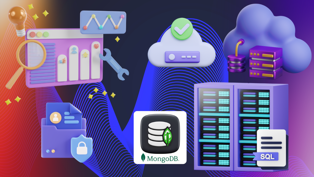
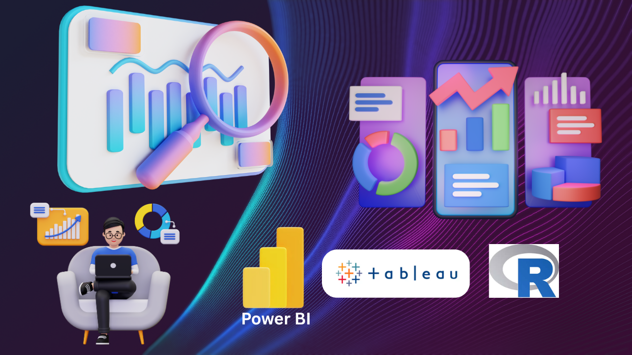
Welcome to Data Analytics and Visualization course, your gateway to mastering the tools and techniques needed to turn complex data into clear, actionable insights. Throughout this course, you'll develop hands-on skills in Excel, Power BI, Tableau, Python, SQL, and R to create dynamic dashboards and interactive reports. You'll learn to work with advanced chart types, automate repetitive tasks, and apply business intelligence concepts for data-driven decision-making. Dive into real-world projects like sales performance tracking, market trend analysis, and customer behavior insights. Explore data storytelling with interactive visuals, including Pareto charts, sunburst diagrams, and geographical maps. Discover how to integrate tools and automate workflows to enhance efficiency. By the end, you’ll be equipped to deliver compelling dashboards that drive results.
Data Analytics and Data Visualisation
Welcome to the Advanced Data Analytics and Visualization, where you'll learn to transform raw data into impactful dashboards using Excel, Power BI, Tableau, and more. Gain hands-on experience with automation, scripting, and advanced visualizations to drive smart business decisions and streamline data workflows.
- Language: English
- Track: Data Science
- Duration: 120 hours
- Level: Master
- Learning Mode: Learn at ALC or Learn Online
- Stream: Any Stream
- Jurisdiction: Maharashtra
- Certificate of Completion
- Learner should preferably a std. 10th Pass student (Not Compulsory)
- It is desirable that Learner should have done MS-CIT Course (Not Compulsory)
KLiC Certificate in Data Analytics and Data Visualisation
Introduction
What you'll learn ?
- You will learn to create and enhance interactive dashboards using Excel, Power BI, Tableau, and Looker Studio.
- You will gain expertise in advanced Excel features like slicers, dynamic filters, and 2D/3D chart customization.
- You will explore advanced visualization techniques including Pareto charts, stacked bar charts, and scatter plots.
- You will learn to automate tasks in Excel using VBA to improve efficiency in dashboard creation.
- You will develop skills in Power BI to transform, clean, and visualize data with Power Query
- You will master the creation of advanced Power BI visuals such as Sankey diagrams, map charts, and sunburst charts.
- You will gain foundational and advanced knowledge in Tableau, including data blending, filtering, and storytelling.
- You will learn Python and R for data manipulation, visualization, and exploratory data analysis.
- You will understand and apply SQL for managing and querying databases for real-time reporting.
- You will discover how to integrate multiple tools and use automation and AI, including ChatGPT-4, for efficient and insightful data analysis.
Syllabus
- Monthly Sales Performance Dashboard
- Expense Tracker Update for Supermarket Dashboard
- Enhancing Sales Dashboard with Slicers
- Enhancing Sales Insights with Date Range Filters
- Dynamic Data Integration for Supermarket Dashboard
- Supermarket Sales Performance Dashboard
- Visualizing Product Performance
- Visualizing Supermarket Performance
- Enhancing Sales Data Visualization with 100% Stacked Bar Charts in a Supermarket
- Optimizing Sales Data Visualization
- Enhancing Clarity in Sales Data Visualization
- Visualizing Yearly Sales Trends for Three Products Using Excel Charts
- Comparing the Effectiveness of 2D vs. 3D Stacked Area Charts for Data Presentation
- Customizing Scatter Charts in Excel
- Visualizing Sales, Marketing, and Finance Trends with Scatter Charts
- Create and Customize Scatter Charts with Straight Lines
- Excel Data Visualization Assignment
- Creating a Combo Chart in Excel
- Sales and Performance Data for Ten Individuals
- Creating and Enhancing Dynamic Scatter Charts in Excel
- Creating and Enhancing Excel Charts
- Visualizing the 80-20 Rule with Excel's Pareto Chart
- Create and Customize Histograms for Sales Data Analysis
- Create and Customize Geographical Data Visualizations
- 3D Geographical Mapping in Excel
- Interactive Data Point Identification in Excel Scatter Charts
- Integrating Dynamic Target Lines in Excel Charts
- Create and Customize Data Visualizations for Clarity and Insight
- Visualizing Year-Over-Year Changes with Trend Arrows in Excel Charts
- Create and Customize Milestone Charts for Project Tracking
- Create and Customize Dynamic Pareto Charts
- Creating and Understanding Dynamic Pareto Charts in Excel
- Creating and Understanding Dynamic Charts in Excel
- Create and Customize a Speedometer Chart for Performance Tracking
- Creating a Speedometer Chart
- Creating and Analysing Excel Charts
- Constructing and Customizing a Basic Bullet Chart in Excel
- Creating Advanced Charts for Better Visualization
- Dynamic Sales Dashboard
- Advanced Conditional Formatting in Excel Dashboards
- Advanced Dashboard Construction and Data Visualization in Excel
- Advanced Dashboard Customization and Visualization
- Creating an Interactive Expense Tracking Dashboard
- Advanced Dashboard Construction and Optimization in Excel
- Building and Customizing an Advanced Dashboard
- Explore and Learn Advanced Data Visualization and Dashboard Enhancements in Excel
- Creating and Customizing an Expense Tracking Dashboard
- Sales & Profit Management Dashboard in Excel
- Creating a Sales Dashboard with Advanced Visualizations in Excel
- Creating an Interactive Sales Dashboard in Excel with Slicers and Timelines
- TechMart Sales Analysis Dashboard
- Regional Sales Performance Dashboard
- Budget Monitoring Dashboard for Monthly Expenses
- Enhancing Sales Performance with Pivot Tables and Slicers
- Top Products and Employees Monthly Sales Analysis
- Interactive Financial Performance Dashboard for ABC Finance Ltd
- Interactive Sales Performance Dashboard for XYZ Retailers
- Quarterly Sales Performance Dashboard for an Indian Retail Store
- Automating Weekly Sales Report with Excel Macros
- Monthly Delivery Performance Dashboard for Logistics Management
- Monthly Sales Performance Dashboard for Top FMCG Products
- Optimizing SuperMart's Inventory and Sales Strategies Using Power BI
- Quarterly Sales Performance Analysis of Product Categories
- Regional Sales Performance Analysis for Last Month using Power BI
- Analysing Textile Production Volumes Last Quarter Report
- Enhancing Sales and Customer Experience with BI at Retail India Pvt Ltd
- Introduction to Power BI Desktop & Power Query
- Creating Engaging Reports in Power BI
- Power Query - Streamline Data Import
- Text Manipulation in Excel Using Power Query
- Text Transformation in Power BI
- Advanced Text Splitting in Power BI
- Date Functions in Power Query
- Basic Date Calculations in Power Query
- Advanced Date Calculations in Power Query
- Date Functions, Prefixes and Suffixes, Basic Arithmetic Operations in Power Query
- Advanced Operations, Modulo, and Percentage Calculations in Power Query
- Math Functions, Rounding, and Number Types in Power Query
- Trigonometric Functions and Conditional Columns in Power Query
- Custom Column Creation and Conditional Logic in Power Query
- Conditional Formatting and Columns in Power Query
- Conditional Columns and Comparisons in Power Query and Excel
- Using Excel Flash Fill and Functions
- Formatting with Flash Fill
- Merging and Splitting Text Columns
- Merging and Splitting Text Columns in Power Query
- Merging Data with Power Query
- Using VLOOKUP in Excel and Merging Queries in Power BI
- VLOOKUP Challenges and Solutions
- VLOOKUP Advanced Techniques
- Merging Datasets in Power BI
- Efficient Column Management in Power Query
- Appending Multiple Excel Sources and Data Sets
- Merging and Refreshing Data in Power BI
- Data Cleaning and Appending in Power BI
- Streamline Tables
- Sales Trends Analysis
- Sales Distribution Analysis by Region
- Advanced Visualizations and Clustered Column Charts in Power BI
- Advanced Chart Techniques in Power BI
- Advanced Visualization Techniques in Power BI
- Enhancing Chart Backgrounds and Formatting Lines and Markers
- Creating and Enhancing Combo Charts
- Working with Power BI Charts and Slicers
- Creating and Formatting Charts in Power BI
- Customizing Pie Chart Data Labels and Modifying Text in Visuals
- Advanced Map Visualizations in Power BI
- Working with Maps and Dynamic Chart Titles in Power BI
- Implementing Dynamic Titles and Single Selections in Power BI
- Advanced Visualization Techniques in Power BI
- Creating and Optimizing Map Visuals in Power BI
- Enhancing Power BI Reports with Visual Borders and Tooltips
- Customizing Canvas in Power BI
- Customizing Filters and Themes in Power BI
- Enhancing Power BI Reports with Custom Themes
- Applying and Customizing Themes in Power BI
- Creating Stacked Area Charts
- Creating Different Chart Types
- Creating Scatter and Waterfall Charts
- Creating Gauge Charts and Scrollers
- Creating and Understanding Sankey Charts in Power BI
- Creating and Customizing Infographic Visualizations and Word Clouds in Power BI
- Utilizing Matrices and Tables in Power BI
- Designing Tables and Generating Sunburst Charts in Power BI
- Utilizing Various Visuals in Power BI
- Applying Filters in Power BI
- Implementing and Utilizing Filters in Power BI
- Implementing and Customizing Text Filters in Power BI
- Using Advanced Text Filters and Top N Text Filters in Power BI
- Using Date Filters in Power BI
- Advanced and Top N Date Filters in Power BI
- Applying Number Filters, Value Filters, and Relative Date Filtering in Power BI
- Customizing Filters and Using Slicers in Power BI
- Managing and Customizing Slicer Selections in Power BI
- Designing Order Date Slicers, Utilizing Hierarchy in Slicers, and Customizing Date Formats in Power BI
- Utilizing Relative Date Slicers in Power BI
- Tableau: A Data Visualization Tool
- Exploring Data with Tableau
- Tableau Desktop and Tableau Public
- Tableau Public Installation and Interface Exploration
- Data Import and Exploration in Tableau
- Efficient Data Integration: Excel Sheets in Tableau for Analysis
- Introduction to Data Exploration in Tableau Public
- Sheet Connections in Tableau Public
- Pricing Structure for Tableau
- Sources of Data in Tableau
- Understanding Dimensions and Measures in Tableau
- Dimensional Analysis - Insights in Tableau
- Distinguish Discrete and Continuous in Tableau
- Discrete vs. Continuous
- An Example using Dimensions and Measures in Tableau
- Data Aggregations in Tableau
- Advanced Measures Exploration in Tableau
- Visualize with Tableau - Charts and Graphs
- Advanced Chart Creation in Tableau
- Tableau Public - Profile, Interactions, and Sharing
- Creating, Customizing, and Managing Reports in Tableau
- Exploring and Customizing Bar Charts in Tableau
- Measures for Customizing Bar Chart Labels in Tableau
- Construct Stacked Bar Charts for Deeper Insights
- Creating Continuous Line Charts with Tableau
- Crafting and Customizing Line Charts in Tableau
- Exploring Scatter Plots in Tableau
- Advanced Techniques for Scatter Plots and Circle Views in Tableau
- Create Dual Axis Charts for Comparative Analysis
- Dual and Combined Axes in Tableau
- Customizing Dual and Combined Axes
- Designing and Crafting Funnel Charts in Tableau
- Funnel Formatting and Final Touches
- Create Crosstabs for Data Comparison
- Develop Highlight Tables for Enhanced Visualization
- Modify Column Data Types for Accurate Analysis
- Manage Data: Renaming, Hiding, and Sorting
- Set Default Field Properties for Efficiency
- Implement Dimension Filters for Focused Analysis
- Apply Date Filters for Temporal Data Analysis
- Utilize Measure Filters for Quantitative Analysis
- Crafting Visualizations and Dashboards in Tableau
- Introduction to Action Filters in Tableau
- Create Interactive Filters for Dynamic Insights
- Apply Data Source Filters for Streamlined Data
- Context Filters for Targeted Insights in Tableau
- Calculated Fields and Top N Filters in Tableau
- Diverse Visualizations and Dashboard Layouts in Tableau
- Applying Filters and Adding Visualizations in Tableau
- Enhancing Visualizations with Action Filters in Tableau
- Advanced Action Filters in Tableau
- What can Python do?
- Why Python?
- Python Installation
- Print Statement with Multiple Techniques
- Displaying Name and Age with the format() Method
- Understanding and Utilizing Different Types of Comments
- Multi-line and DocString Comments
- Strings, Numeric, and Complex Data Types
- Lists, Tuples, Ranges, and Dictionaries in Python
- Indexing, Slicing, and Essential Methods
- String Functions and Boolean Operations
- Sets, Frozen Sets and Booleans in Python
- Understanding Byte, ByteArray, and Memory View
- Python Handling User Input with Ease
- Operations and Tuple Modifications
- Arithmetic and Assignment Operators
- Comparison and Logical Operators
- Understanding Rules and Examples for Python Indentation
- Structure in Loops
- Conditional Statements in Python
- Simple If and If-Else Statements
- Advanced If-Else and Nested IFs
- An Example with If and Its Related Statements
- Python's While Loops
- Infinite Loops and Break Statements
- Python's For Loop
- For Loops with Dictionaries and Sets
- Python's Range Function Basics
- Advanced Techniques for Range Functions
- Break & Continue
- Assert
- Python Looping Essentials
- Advanced Looping Techniques in Python
- Create a Function
- Function Type
- Fundamentals of Variable Arguments in Python Functions
- Advanced Applications of Variable Arguments in Python
- Scope of a Function
- Function Documentations
- Lambda Functions & Map
- Basics to Advanced Applications in Python
- Functions for String Manipulation and Data Types
- Create a Module
- Python's Standard Math Modules
- Time with Standard Modules
- Local to Global Variables in Python
- Advanced Local and Global Variables
- Python Errors - From Syntax to Runtime
- Error Handling in Python
- Python Exception Handling
- Type Errors and Custom Solutions
- File Handling - Reading, Writing, and Appending
- File Handling - Modes, Closing, and Best Practices
- Custom Exceptions in Python
- Implementing and Utilizing Custom Exceptions
- Python File Reading Essentials
- Reading and Analyzing Words and Lines in Python
- New-Style Classes in Python
- Python's Class Hierarchy and Inheritance
- Creating Classes
- Instance Methods
- Inheritance in Python - Foundation of Superclass
- Subclassing and Method Overriding
- Polymorphism
- Python Exception Handling - Basics
- Creating and Utilizing Custom Exceptions in Python
- Namedtuple
- Operations, Instantiation, and Advanced Features
- Rotations and Element Access in Python
- Accessing and Modifying Mappings
- Custom ChainMap Class in Python
- Counter
- OrderedDict
- Defaultdict
- UserDict, UserList, and UserString
- Introduction and Installation
- DB Connection
- Getting Started with MySQL
- Crafting Tables in MySQL
- Inserting Data into MySQL Tables
- Reading, Updating, and Deleting Data in MySQL
- COMMIT & ROLLBACK operation
- MySQL Error Handling
- Handling Errors in MySQL Operations
- An Introduction to Built-in Iterators
- Custom Iterators for Squares
- Range-like Iterators
- Sleep
- Techniques for Measurement in Python
- Calculating Execution Time with Python's timeit and time Module
- Time Representation in Python
- Creation to Arithmetic Operations
- Data Filtering in Python
- Filtering Non-Empty Strings and Unique Emails
- Python's map, filter, and reduce
- Python's map and star map for Enhanced Functionality
- Reduce
- Basic Decorators Functionality
- Decorators for Enhanced Functionality
- Frozen set
- Python's Collections Module and Its Core Components
- Collections for Enhanced Data Handling and Manipulation in Python
- Python String Manipulation
- Handling Whitespace and Delimiters with Split()
- Identifying Various Date Formats in Python
- Email Validation with Regular Expressions in Python
- Power of Quantifiers in Regular Expressions
- Lazy and Non-Greedy Quantifiers in Regular Expressions
- Exploring Match, Search, and Fullmatch in Python
- Leveraging find all and finditer Functions in Python
- Search, Substitute, and Named Groups
- Search and Substitute Functions with Regular Expressions
- Advanced Replacement Techniques with sub N Function and Practical Examples
- Exploring Patterns, Classes, and Case-Insensitive Matching in Python
- Ranges, Delimiters, and Specific Patterns in Python
- Exploring Character Classes and Search Methods in Regular Expressions
- Managing Special Characters with Escape Sequences and Anchors
- Discover Google Sheets Features
- Navigate Google Sheets with Ease
- Create and Save Your First Spreadsheet
- Spreadsheet Formatting
- Advanced Spreadsheet Formatting
- Collaborate and Share Spreadsheets Efficiently
- Basic Formula and Functions
- Introduction to Absolute and Mixed References
- Common Math Functions and Operations
- COUNTIF, SUMIF, and SUMIFS Functions
- Text Manipulation Functions
- LEFT, RIGHT, MID, and FIND Functions
- Date and Time Functions in Google Sheets
- NETWORKDAYS and TEXT Functions
- IF Statements, and Nested IFs
- VLOOKUP and HLOOKUP Functions
- Sort and Filter Data for Enhanced Insights
- Data Validation and Data Integrity
- Date and Text Validation
- Analyze Data Efficiently with PivotTables
- Date Data Grouping, Extracting and Filtering
- Visualize Data with Charts and Graphs
- Creating Stacked Columns, Combo Charts, and Line Graphs
- Conduct Advanced Data Analysis Techniques
- Enhance Teamwork with Comments and Tools
- Track Changes with Revision History
- Automate with Google Apps Script Basics
- Create Custom Functions and Macros
- Create Macros to Automate Task
- Automate Routine Tasks in Google Sheets
- Setting Triggers for Spreadsheet Opening
- Apply Advanced Cell Formatting Techniques
- Implement Conditional Formatting for Insights
- Create Custom Conditional Formats for Data
- Use Templates for Consistent Data Reports
- Master Advanced Formatting for Professional Reports
- Import Data Seamlessly from Various Sources
- Export Data in Multiple Formats for Use
- Query Data within Google Sheets for Insights
- Connect Sheets with Apps for Streamlined Workflow
- Clean and Transform Data for Analysis
- Create Interactive Charts for Dynamic Insights
- Utilize Sparklines for Compact Data Visualization
- Implement GeoMapping for Geographic Data Analysis
- Customize Column Charts
- Chart Customization for Enhanced Data Storytelling
- Analyze Trends with Advanced Visualization
- Automate Reports for Up-to-Date Dashboards
- Integrate Sheets with Data Pipelines for Efficiency
- Optimizing Google Sheets to Overcome Limitations
- Function Optimization and Execution Control
- Apply Advanced Tips for Efficient Data Analysis
- Recap: Transform Data Entry into Actionable Insights
- Why Choose Looker Studio?
- Setting Up Looker Studio
- Exploring the Interface
- Creating Your First Visualization
- Saving the Look in Looker
- Introduction to Filtering
- Filtering in Looker Using Measures
- Overview of Visualization in Looker
- Creating Bar and Column Charts
- Adding Dimensions, Pivoting, and Grouping
- Grid Layout, Pivoting, and Spacing
- Designing Line Charts
- Pie Charts for Data Distribution
- Introduction to Scatterplots
- Advanced Scatterplot - Trend Lines, Reference Lines, and Saving
- Utilizing GeoMaps
- GeoMap Scale, Position, Zoom, and Saving
- Single-Value Visualization
- Introduction to Customs in Looker
- Creation and Interpretation of Table Calculations
- Permissions, Limitations, and Key Distinctions
- Custom Dimension Creation
- Binning as a Custom Dimension
- Grouping Data with Custom Dimensions
- Developing Custom Measures
- Look View Mode in Looker
- Data and Filters in View Mode
- Different Options in Look View Mode
- Customizing Dashboard Layout and Design
- Filter Adding to the Dashboard
- Optimizing Dashboards with Filters, Linked Filters, and Tile Management
- Setting Up Tiles and Filters Dashboard
- Creating and Managing Folders
- Downloading the Data from Looker
- Sharing Looks and Sending Mails from Looker
- Sharing Dashboards and Sending Mails from Looker
- Creating Boards in Looker
- Overview of R
- Introduction to Data Types in R
- Understanding Data Type Casting
- Introduction to Variables in R
- Variable Methods and Naming Conflicts
- Operators in R
- Reading Data Files in R
- The Reader Package, CSV Files, and read_lines Function
- Data Import with read_table and read_CSV
- Writing Data inside R
- Introduction to Decision Making
- Nested If-Else-If Statement, Switch Statement
- Introduction to Loops
- Nested For Loops, Break Statement & Next Statement
- Repeat Loops & While Loops
- Introduction to String Functions
- Standardizing Text Case in R
- Creating Date Objects in R
- Formatting Dates & Handling Time Data
- Calculating Date and Time Differences
- Math Functions in R
- Introduction to Arrays & Multidimensional Structures
- Accessing Elements, Rows & Columns
- Introduction to Lists in R
- Manipulating Lists
- Introduction to Data Frames in R
- Multiple Activities using Data Frames in R
- Introduction to Vectors in R
- Manipulation of Vectors and Factors
- Introduction to Matrices in R
- Accessing Matrix Elements & Modifying Matrices
- Combining Matrices & Creating Special Matrices
- Introduction to Charts and Graphs, Bar Plots, Histograms
- Box Plots, Multiple Box Plots, Scatter Plots, Heat Maps & 3D Graphs
- Scatter Plots
- 3D Scatter Plots, Box Plots, Colored Box Plots & Multiple Box Plots in One Plot
- Bar Plots & Labeled Bar Plots
- Grouped Bar Plots, Stacked Bar Plots & Histograms
- Conducting T-tests
- Working with Excel Files in R
- Managing CSV Files in R
- Introduction to Advanced Data Import Techniques
- Reading XML Files & Reading Data from Websites
- Understand ChatGPT-4's Capabilities
- Understand ChatGPT-4's Limitations
- Set Up ChatGPT-4 for Efficient Data Analytics
- Create Datasets Using Diverse Sources and Techniques
- Clean Data by Identifying and Resolving Irregularities
- Classify Data Types and Structures for Analytics
- Learn Basic Data Transformation Techniques
- Execute Simple Data Queries Using ChatGPT-4
- Data Analysis and Exploration with ChatGPT
- Cleaning, Analysis, and Visualization with ChatGPT
- Analyze Market Trends with ChatGPT-4
- Perform Real-time Data Processing and Analysis
- Apply Predictive Analytics in Business Decision-Making
- Utilize ChatGPT-4 for Understanding Financial Reports
- Missing Values and Outliers
- Normalize and Standardize Data for Consistency
- Engineer Features to Enhance Data Analysis
- Preprocess Text Data for Effective Analysis
- Understanding Date and Time Data with ChatGPT
- Extracting, Analyzing, and Enhancing Date of Birth Data
- Prepare Data for In-Depth Analysis
- Apply Effective Data Visualization Principles
- Create Basic Charts and Graphs Using ChatGPT-4
- Form Histograms & Bar Charts
- Generate Advanced Visualizations: Heatmaps and Boxplots
- Build Interactive Dashboards and Compelling Data Stories
- Real-Time Dashboards with ChatGPT
- Apply Best Practices in Data Presentation
- Perform Exploratory Data Analysis with ChatGPT-4
- Analyze Data Statistically and Summarize Metrics
- Introduction, Anomalies, Patterns, and ChatGPT Exploration
- Spotlight on Anomaly Detection and Box Plot Analysis
- Analyze Correlation and Causation in Data Sets
- Insights on Correlation and Causation
- Extract Inferences from Exploratory Data Analysis
- Understanding Employee Attrition and Strategies for Retention
- Perform Regression Analysis with ChatGPT-4
- Apply Classification Techniques in Data Analytics
- Conduct Time Series Analysis and Forecasting
- Implement Clustering
- Conduct Sentiment Analysis and Study Consumer Behavior
- Generate Custom Code for Data Analytics with ChatGPT-4
- Seamlessly Integrate ChatGPT-4 with Analytical Tools
- Master Advanced Data Querying and Retrieval with ChatGPT-4
Certificate
- MKCL provides certificate (for 30/60/90 hours courses) to the KLiC learner after his/her successful course completion.
Academic Approach
The Academic Approach of the course focuses on the “work centric” education i.e. begin with work (and not from a book !), derive knowledge from work and apply that knowledge to make the work more wholesome, useful and delightful. The ultimate objective is to empower the Learner to engage in socially useful and productive work. It aims at leading the learner to his/her rewarding career as well as development of the society.
Learning methodology
- Learners are given an overview of the course and its connection to life and work.
- Learners are then exposed to the specific tool(s) used in the course through the various real-life applications of the tool(s).
- Learners are then acquainted with the careers and the hierarchy of roles they can perform at workplaces after attaining increasing levels of mastery over the tool(s).
- Learners are then acquainted with the architecture of the tool or Tool Map so as to appreciate various parts of the tool, their functions and their inter-relations.
- Learners are then exposed to simple application development methodology by using the tool at the beginner’s level
- Learners then perform the differential skills related to the use of the tool to improve the given ready-made outputs.
- Learners are then engaged in appreciation of real-life case studies developed by the experts.
- Learners are then encouraged to proceed from appreciation to imitation of the experts.
- After imitation experience, they are required to improve the expert’s outputs so that they proceed from mere imitation to emulation.
- Finally, they develop the integral skills involving optimal methods and best practices to produce useful outputs right from scratch, publish them in their ePortfolio and thereby proceed from emulation to self-expression.
Evaluation Pattern
Evaluation Pattern of KLiC Courses consists of 4 Sections as per below table:
| Section No. | Section Name | Total Marks | Minimum Passing Marks |
|---|---|---|---|
| 1 | Learning Progression | 25 | 10 |
| 2 | Internal Assessment | 25 | 10 |
| 3 | Final Online Examination | 50 | 20 |
| Total | 100 | 40 | |
| 4 | SUPWs (Socially Useful and Productive Work in form of Assignments) | 5 Assignments | 2 Assignments to be Completed & Uploaded |
MKCL’s KLiC Certificate will be provided to the learner who will satisfy the below criteria:
- Learners who have successfully completed above mentioned 3 Sections i.e. Section 1, Section 2 and Section 3
- Additionally, learner should have completed Section 4 (i.e. Section 4 will comprise of SUPWs i.e. Socially Useful and Productive Work in form of Assignments)
- Learner has to complete and upload minimum 2 out of 5 Assignments
KLiC Courses Fee Structure from 01 July, 2025 Onwards
KLiC 120 hour course fee applicable from 01 July, 2025 all over Maharashtra| KLiC Course Duration | MFO: MKCL Share (Including 18% GST) |
ALC Share (Service Charges to be collected by ALC) |
MKCL Certificate | YCMOU Marksheet |
|---|---|---|---|---|
| 120 hours (Without YCMOU Marksheet) | Rs. 1,000/- | Rs. 5,000/- | Available | Not Available |
| 120 hours (With YCMOU Marksheet) | Rs. 1,118/- | Rs. 5,000/- | Available | Available |
* Above mentioned fee is applicable for all Modes of KLiC Courses offered at Authorised Learning Center (ALC) and at Satellite Center
* Total fee is including of Course fees, Examination fees and Certification fees
* MKCL reserves the right to modify the Fee anytime without any prior notice